DataVis2012/Assignment 1
This is your first assignment for Data Visualization.
The assignment is due at midnight on March 12th, 2012.
The purpose of this initial assignment is to make sure you familiarize yourself with basic concepts of the VisTrails system, VTK, and matplotlib. As you work on it, we encourage you to read the available documentation on those tools (links available from the class wiki).
Use Vistrails file Assignment1.vt as the starting point for all problems in this assignment. Open this file and start working on the problems. Save your progress. Don't worry if you make mistakes, that is the beauty in Vistrails you can always redo, undo and/or branch from any point in the history tree. In the end you will have an updated Assignment1.vt file with the original file plus all your work. This will be the file that you should turn in.
Part of the purpose of this assignment is to make sure you understand the basic plotting concepts covered in class and learn matplotlib/python/Vistrails as a tool do produce plots. Examples of plotting were provided in the lectures and can be found here: PlottingVistrails.zip. As you work on the assignment, we encourage you to read the available documentation on both matplotlib and python.
Problem 1: query by tag, execute, annotate and query by example
To make sure you know how to search versions in the history tree of Vistrails do the following simple tasks:
1) Locate the version tagged "101" in the History tree. Use the text field close to the magnifying glass icon in the right side of the window. Execute this version and annotate it with the name that appears in the visualization.
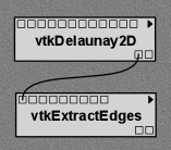
2) Find the only version in the history tree that has the pattern shown below. Use the query by example feature of Vistrails. Annotate this version with the word "ok".
Problem 2: pipeline from an image
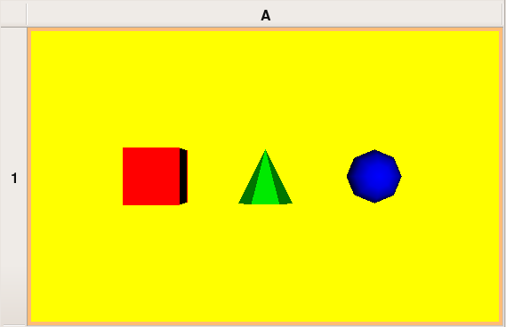
From the root version on the history tree design a pipeline to reproduce the image below.
Tag the version with the resulting pipeline with label "Problem 2".
Problem 3: pipeline from C++ code
Starting from the root version on the history tree design a pipeline that is equivalent to the C++ source contQuad.cxx.
Tag the version of the resulting pipeline with label "Problem 3".
Problem 4: parameter exploration
Find the version tagged "spx" in the history tree. Execute this version and play with the resulting visualization. The goal is to generate several isosurfaces of this model using the parameter exploration feature of Vistrails.
First a modification in the "spx" pipeline is necessary to be able to extract a single isosurface of the model. Here are the steps: (1) modify the "spx" pipeline by inserting a "vtkContourFilter" in the middle of the connection from "vtkUnstructuredGridReader" to "vtkDataSetMapper" and (2) select the new "vtkContourFilter" and use the "SetValue" method with parameters 0 (Integer) and 0.5 (Float) to extract the isosurface of value 0.5 from the model. Execute this pipeline and you should see a green isosurface.
With the "modified-from-spx" pipeline selected in the history tree go to the "Exploration" view of Vistrails. On the right side of the screen you should see the text "SetValue(0,0.5)". Drag this text to the middle of the screen. Now, for the Float parameter, select the range from 0.03 to 1. Choose to generate 6 steps in a single horizontal row of the spreadsheet. Press "Execute". As a result you should 6 isosurfaces in the spreadsheet. Identify the "red" one, and add it to the version tree. This can be done by going into the "View" menu on the spreadsheet, selecting "Editing Mode" and clicking on the "Create Version" icon in the spreadsheet cell showing the "red" isosurface. The history tree should have a new node that you should tag "Problem 4". (You can change the spreadsheet back to interactive mode by using the "View" menu again: "Interactive Mode".)
Problem 5: matplotlib
In the version tree node "iso + histogram", part of the pipeline computes a histogram of the scalar values of a structured volumetric grid. As part of this problem, you need to compute the histogram for the unstructured grid from the version "spx". You should use 30 bins for your histogram.
You should tag the version of the resulting pipeline as "Problem 5".
Problem 6: Principles of plotting and connectd symbols plot
The data for the following four problems of this assignment are in four files: stocks.dat (problem 6), actions-fall-2007.dat (problem 7), microprocessors.dat (problem 8) and genes.dat (problem 9). These four files are packed into a single zip file called: Hw1data.zip. The task of unzipping and locating these files is already done in the starting vistrails file for this assignment: Assignment1.vt. You should solve the problems by working directly in this vistrails file. When you open Assignment1.vt you will see four tagged versions that basically loads the raw data needed in each of the four problems. As before, show your work by submitting the complete vistrail you used to solve the problems.
The file stocks.dat has the first quote for each month from January 2006 to September 2008 for the papers from Apple Inc. (AAPL) and Microsoft Corporation (MSFT). Below we present the first three lines and the last two lines of this file.
month,apple,microsoft
2008-09,140.91,25.16
2008-08,169.53,27.29
...
2006-02,68.49,25.92
2006-01,75.51,27.06
(a) Apply the principles of plotting described in class and in the class notes to generate a simple connected symbol plot for all Apple's quotes in the file stocks.dat. Tag the final version of this plot as "Problem 1a" and annotate it with an explanation of the plotting principles you used to make this a clear plot.
(b) Using as reference the quote of January 2006 directly compare the progress of Apple's and Microsoft's papers by generating a plot using superposition (both curves in the same plot). Tag this final plot as "Problem 1b" and annotate it with the conclusions you can draw from this plot.
(c) Repeat item b, but now using juxtaposition: split the two curves (i.e. Apple's paper progress relative to January 2006 and Microsoft's paper progress relative to January 2006) into two different plots (each plot in a different spreadsheet cell). Tag the final version as "Problem 1c" and annotate it describing which technique (superpostion vs. juxtaposition) makes more sense for this data and why.
Problem 7: Histogram and number of bins
In the Fall of 2007, during the Scientific Visualization Course we collected all the assignments of the students in Vistrails' format. The file actions_fall_2007.dat has all the timestamps of all the actions of all the students in all the assignments: a total of 132131 actions. The first three lines of this file are:
timestamp
2007-09-15 21:24:56
2007-09-15 21:25:16
...
Create a histogram for the distribution of these timestamps and highlight the following due dates in the histogram. (obs. note that by some reason assignment 5 had a due data before assignment 6).
| Assigment | Due Date            |
|-----------+---------------------|
|         0 | 2007-09-18 12:00:00 |
|         1 | 2007-09-18 12:00:00 |
|         2 | 2007-10-04 12:00:00 |
|         3 | 2007-10-25 12:00:00 |
|         4 | 2007-11-27 12:00:00 |
|         5 | 2007-12-15 12:00:00 |
|         6 | 2007-12-11 12:00:00 |
When you finish your histogram tag its pipeline version with "Problem 2". And annotate it answering the following questions:
(a) How did you select the bins for the histogram and why?
(b) What hypothesis can you make about the amount of work (i.e. number of actions) for the different assignments just by looking to this histogram.
(c) What pattern can you observe for the amount of work (i.e. number of actions) close to the deadlines?
Problem 8: Dot plots for labeled data
Each line of the file microprocessors.dat (except for the header line) has two quantitative values associated with a label. The quantitative values are "year of introduction" and "number of transistors" and the label is the name of a "microprocessor" (e.g. 286, 386, 486, Pentium 4). See the first three lines of this file:
Processor,Year of Introduction,Transistors
Pentium 4 processor,2000,42000000
286,1982,120000
...
Generate two dot plots horizontally juxtaposed for these microprocessors: one for "year of introduction" and the other for "number of transistors". For "number of transistors" dot plot use log base 10 scale. The two plots should be in the same spreadsheet cell. Tag your final pipeline version as "Problem 3".
Problem 9: Correlation, scatterplots and regression
Let A, B, C, D be four genes. A scientist measured the activity (i.e. the expression) of these genes in 100 different conditions. The results are given in file genes.dat. Here are the first three lines of this file:
A,B,C,D
0.636244,0.239430,0.745650,0.900198
0.342974,0.800676,0.375399,0.457818
...
Generate a 4 x 4 matrix of scatter plots to understand correlations between the four genes. Visually analyze the plot and rank the genes B, C, D in decrescent order of correlation to A. Now draw a linear best fit line in the plots of A with its most correlated gene, a cubic best fit curve in the plots of A with its second most correlated gene and a degree-5 polynomial best fit curve in the plots of A with its most uncorrelated gene. Tag the final pipeline version that does all this plots (in a single spreadsheet cell) as "Problem 4".

